Low Power Software Aesthetics
22 Sept 2024
My work is often interpreted as "retro" or "nineties". I find this quite frustrating, because I'm not trying to reference a byegone age, and I'm certainly not trying to evoke nostalgia. I'm not trying to return to the past, but to indulge in a more expansive present, rather than having to perform enthusiasm for a technofuture that does not align with my values (VR, Web 3.0, GenAI, etc.). I try to make computers destined for landfill work effectively as machines for art. I reject the compulsion to buy a new games console, laptop, and smart phone every 3-4 years. I imagine a future of repairable devices, free and open source software, and the right to adapt our personal digital environments as we see fit. I struggle to find ways to flag this visually without at the same time pointing to a past era, precisely because I aim to reject the aesthetic failings of our contemporary moment.
See permacomputing as invitation to collectively and radically rethink computational culture. It is not a tech solution searching for a problem.
It is as though the work of reconfiguring our relationship with technology was mostly invisible. In fact, that's largely accurate - this becomes clear when reading Permacomputing's reviews of software projects, which often highlight processes and architectures that are not visible at the UI level. Many of the projects listed there do indeed use design motifs from the 1980s and 1990s. Because I periodically spend time exploring this world, I not longer interpret these motifs as references to a byegone age per se; they reference classic designs that have something to teach us about how to work creatively with limitations. But because most people do not engage with the materiality that underpins these design choices, it's natural that they are read simply as retro aesthetics for the sake of it.
The problem is not really solvable. The purpose of work in this field isn't to achieve a particular aesthetic, but to work towards a material shift in how computing impacts the world around us. However, since wasteful technology is often created in pursuit of aesthetic goals such as "immersion", the material shift necessarily entails an aesthetic one. Moreover, establishing an aesthetic style that signals environmental values would inevitably lead to greenwashing, insincere and misleading use of that aesthetic by corporations that do not materially commit to the kind of shift that is needed.
Having said all that, I still think it is worth collecting a handful of aesthetic references from contemporary projects that aim towards repairability, sustainability, and working with what we have at hand. Perhaps if I can tip my hat to people who have been putting in the work that allows me to begin to attempt any of this, there will be some people who understand what they are seeing when they look at my own work.
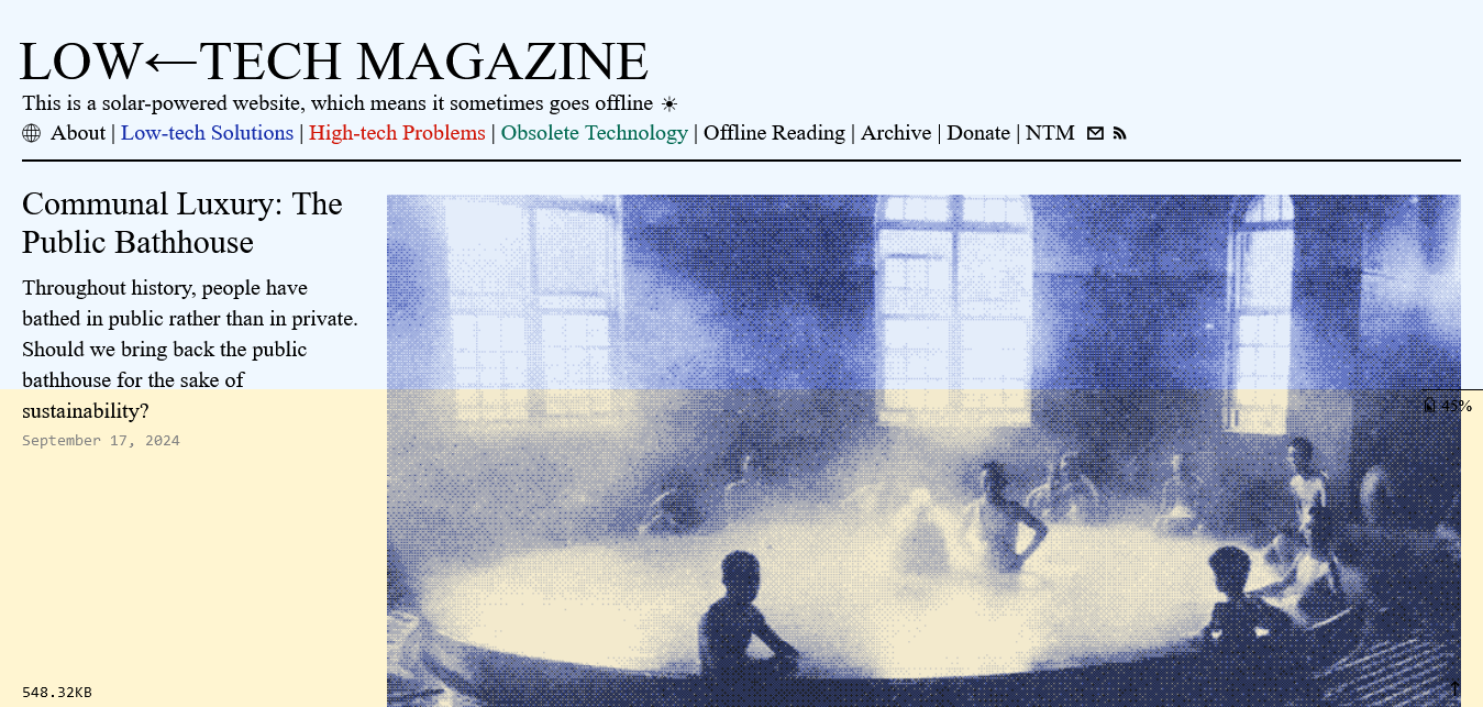
Low Tech Magazine
A project that unifies form and content, Low Tech Magazine is a solar-powered website that aims to run with the lowest footprint possible. There are several visual cues in the site's design that immediately signal its reduced impact: the dithered image compression is particularly distinctive. At the same time, it uses contemporary features of HTML and CSS, such as the grid layout for the articles list, and the viewport height unit for the battery indicator. They published a deep dive on their redesign with some illuminating insights into the tech behind all of this.
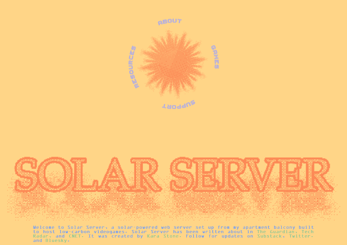
Solar Server
Kara Moonstone's inspiring project aims to host artgames on a server powered by a single solar panel on an apartment balcony. This is another solar website with compelling use of dither compression!
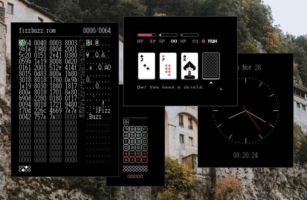
Hundred Rabbits
An artist duo sharing a suite of attractive, lightweight software tools for creating digital work on a livaboard boat with unstable internet. I'm particularly fond of Dotgrid, while the stunning ambition and collaboration around their virtual computer UXN is like a guiding light in the dark when it comes to sustainable software aesthetics.
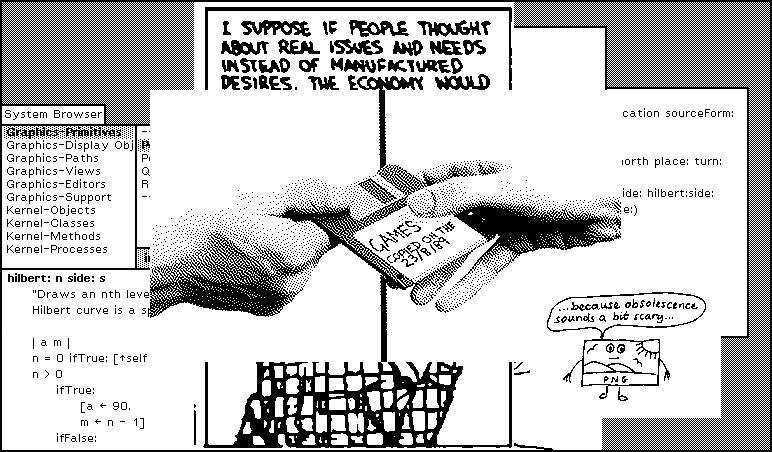
If we can agree that technology is only worthwhile as long as it benefits society, we must give people power over the technological system that rules their life, and the means to take them apart. It is extremely important for these systems to go beyond solutions, and include knowledge of the whole narrative that encompasses software. Software is not just an app that you download, it's also an definition of how to solve a problem.
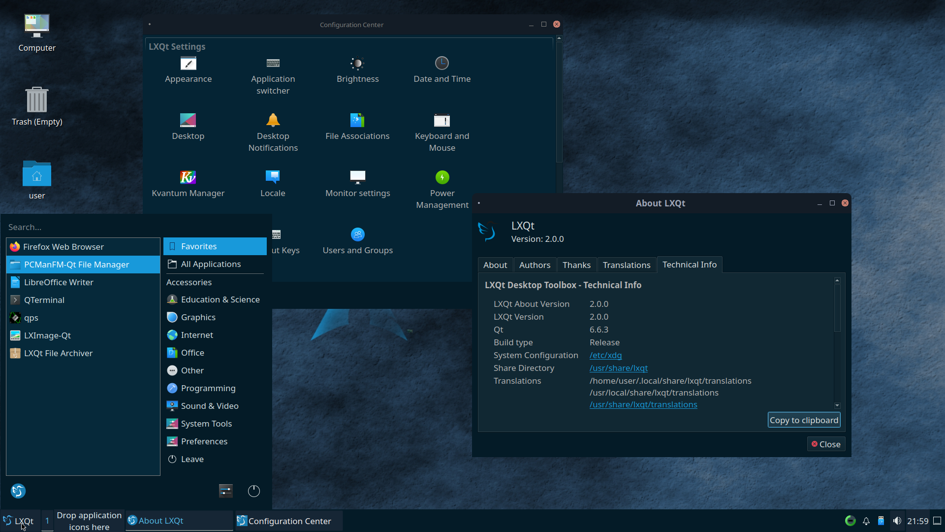
LXQt desktop environment
For me, LXQt defines what a reanimated or low-end computer looks like. Raspian's desktop environment is based on this one, and it's what I install on almost any ailing device. The 2009 netbook that I use for algorithmic music making looks like this. When I imagine a future where we are making our existing devices last for as long as possible, this is what immediately springs to mind - with vibrant customisation by each user, of course!
There is a historical referent here that explains why designs based on LXQt might be perceived as "retro" - it aims to provide a familiar experience to users who are accustomed to Windows or Mac OSes, which leaves very little scope for playfully reimagining what a computer might look like. The project began in the late 2010s, so to some extent its aesthetic may have been frozen in time since then.
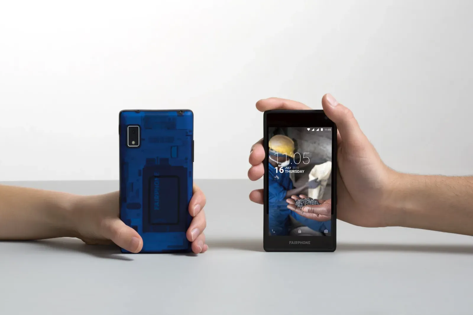
Fairphone
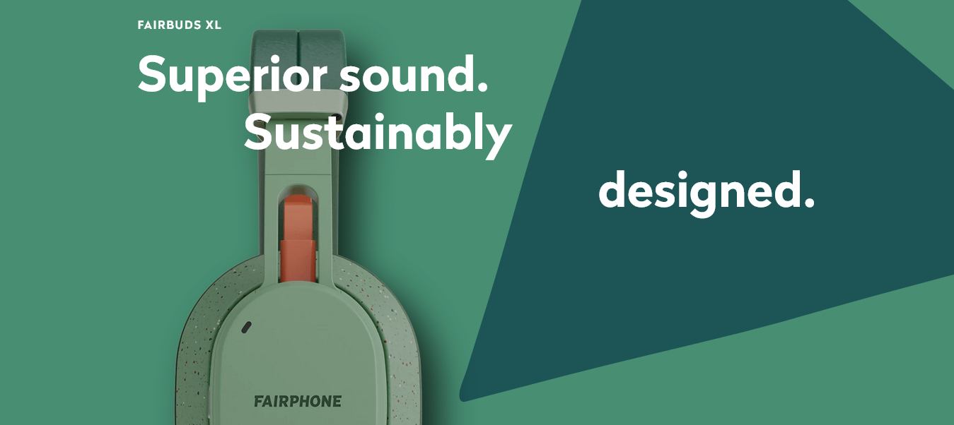
I'm a pretty loyal Fairphone user - I have a Fairphone 4, and when my third pair of Bluetooth headphones died, I was thrilled to get the Fairbuds XL. It is immediately apparent when looking at the Fairbuds XL that the cable connecting the two speaker modules, in a contrasting earthy colour, is an ordinary USB-C cable, signalling the ability to quickly and easily carry out repairs. Fairphone do a great job of making the process of opening up a device feel joyful and empowering, with playful visual details and slogans included on many internal parts.
Their approach to software is less developed. They've partnered with Murena to bring the de-Googled E/OS operating system to their phones, but aesthetically there is nothing in particular that seems to distinguish E/OS from mainstream UI design. I'm curious to see what would happen if they applied the same principles to their software design as they do their hardware design.